Key findings
The three things that mattered most – AI-written, every number checked against your data.
After every event, ExpoFP sends you a report on what attendees searched for, where they went and which exhibitors drew attention – with ready-to-forward cards for your next sponsors. No setup, no export, no analyst.
0
setup steps
46
reports sent in the first wave
3.2×
sponsors' share of attention vs share of exhibitors
0
attendee names or emails in the report
Each section answers one question: what happened, why it matters and what to do next.
The three things that mattered most – AI-written, every number checked against your data.
Your rates against the median of similar-size events on ExpoFP.
Planning before the event vs navigation on site, peak day and busiest hour.
What people typed – and verified searches for each exhibitor's name.
Most-requested destinations and the busiest routes between them.
Which profiles attendees opened – sponsors and non-sponsors.
How sponsors performed against the rest of the exhibitor base.
Views per onsite kiosk – which units to replicate and which to move.
One metric, one action, for each priority before the next edition.
Pages from a real ExpoFP report, with names and numbers anonymized. Open any page to see it full size.
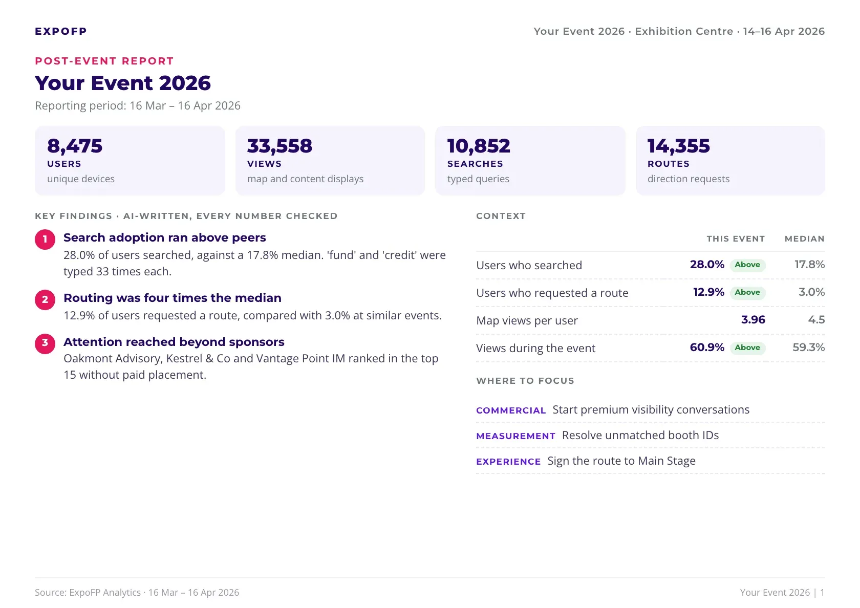
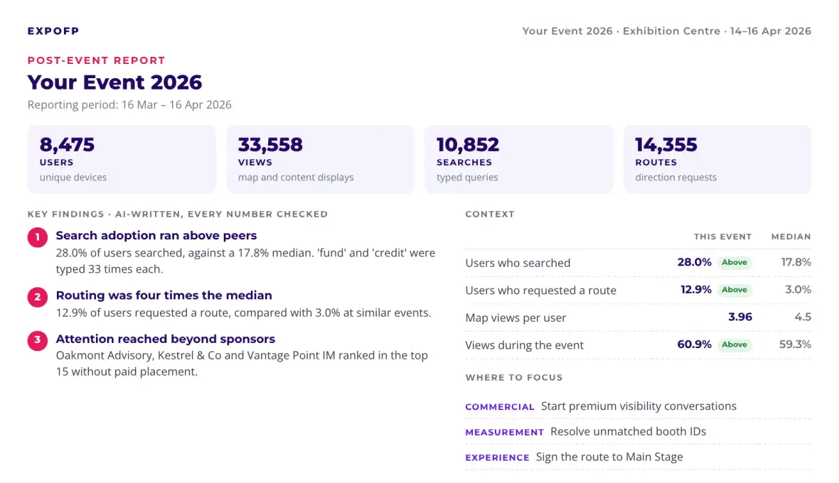
Page 1 · Summary
Four headline numbers, three findings and a comparison with similar events. Forward it to your team or board as it is – it answers "how did it go?" before anyone asks.
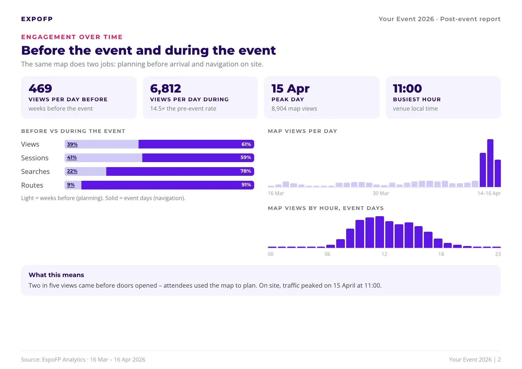
Page 2 · Engagement over time
Planning before the show against navigation on site, the peak day and the busiest hour. Use it to time pre-event emails and to staff info desks when attendees need them most.
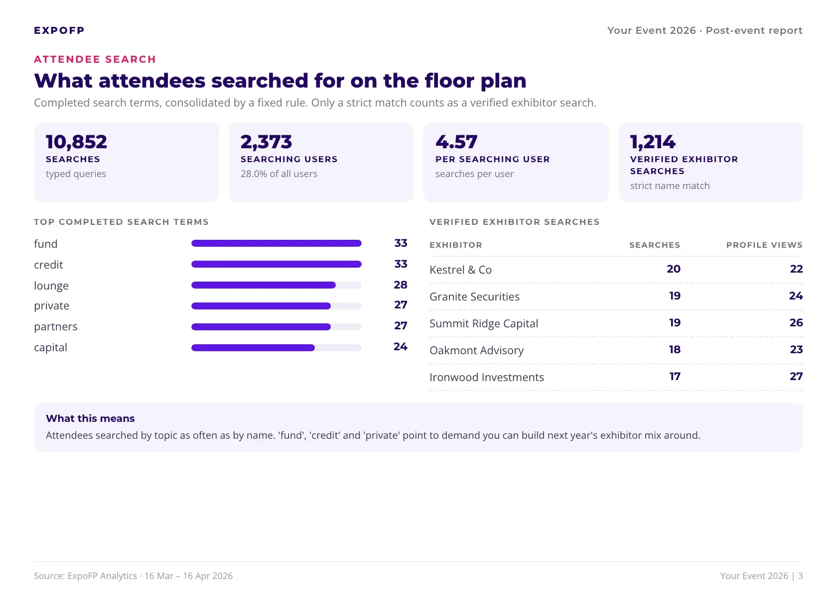
Page 3 · Attendee search
The terms people typed, and how often each exhibitor was searched by its exact name. It shows real demand – topics to program around and exhibitors attendees came for.
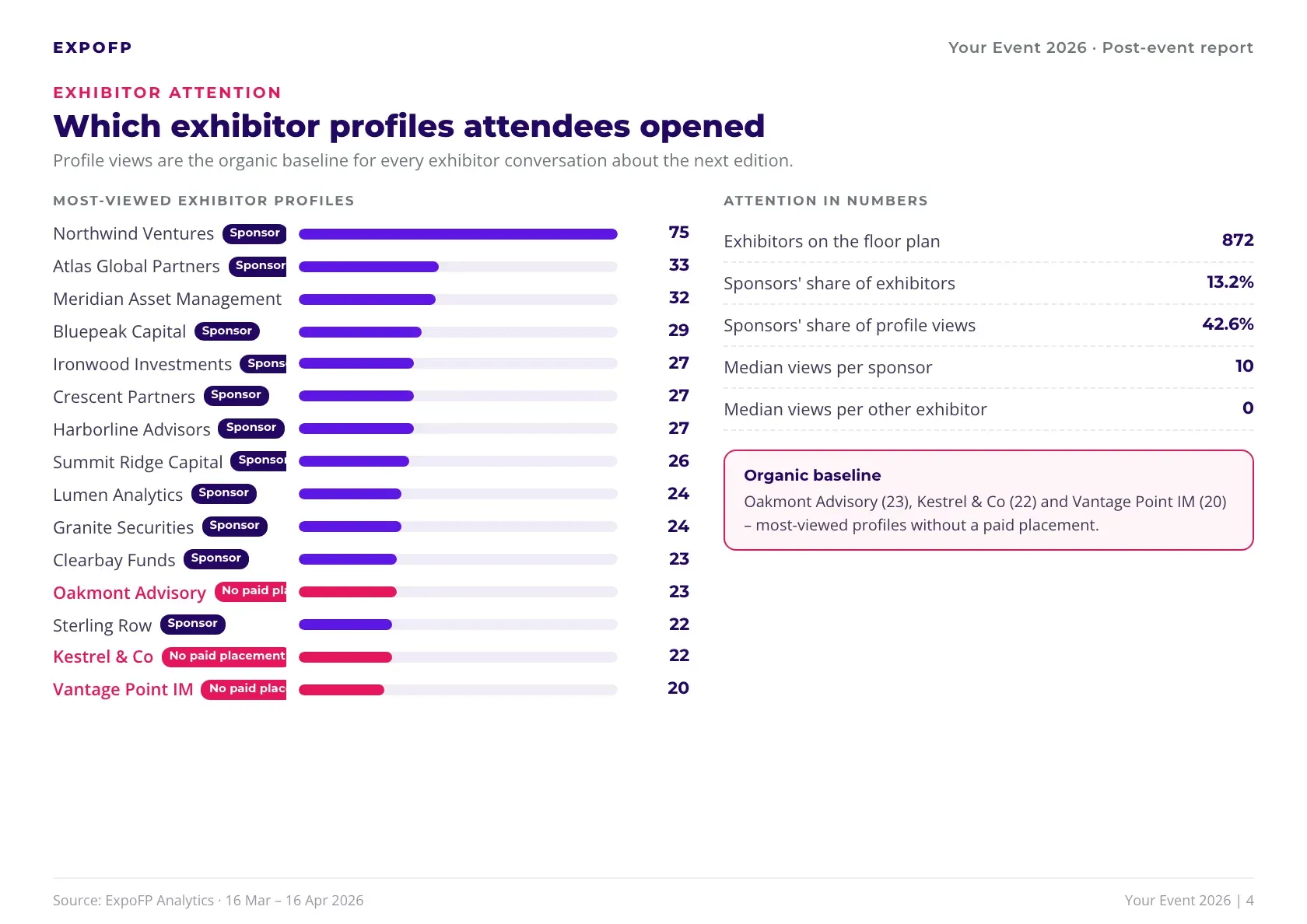
Page 4 · Exhibitor attention
Every exhibitor ranked by profile views, sponsors marked. The pink rows are your warmest sales leads: exhibitors attendees looked for even though they paid for nothing.
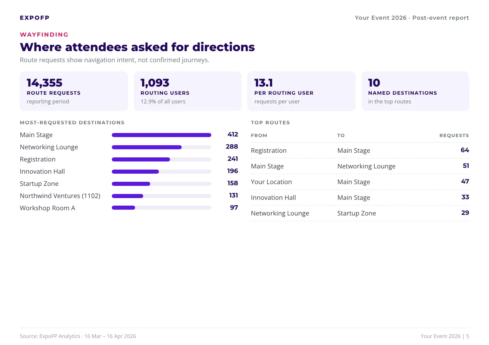
Page 5 · Wayfinding
The most-requested destinations and the busiest routes between them. Fix signage where demand is highest, and place booths along routes attendees already take.
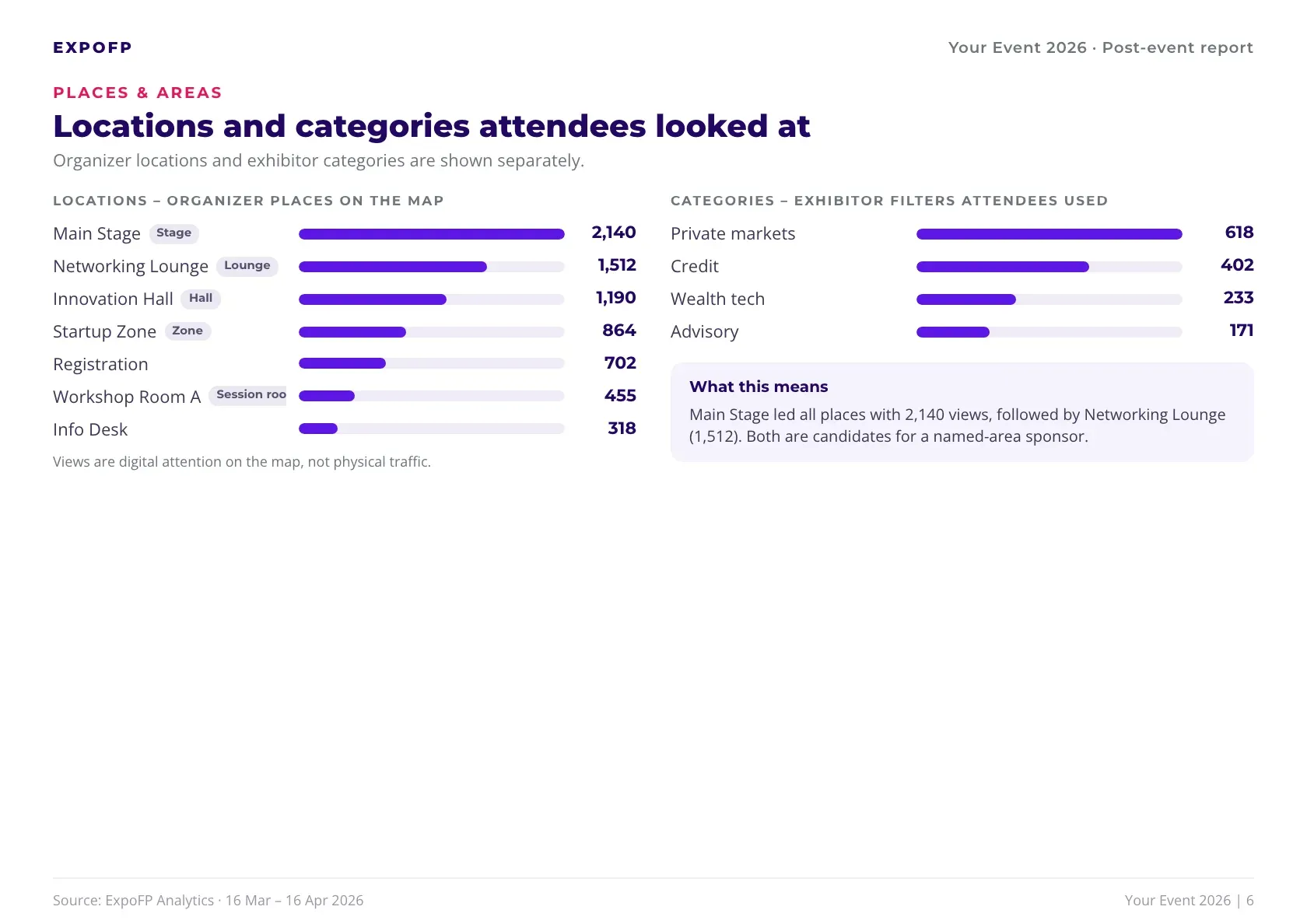
Page 6 · Places & areas
Views for every place you own and every category filter attendees used. It tells you which areas to keep, which to move, and which to offer a sponsor by name.
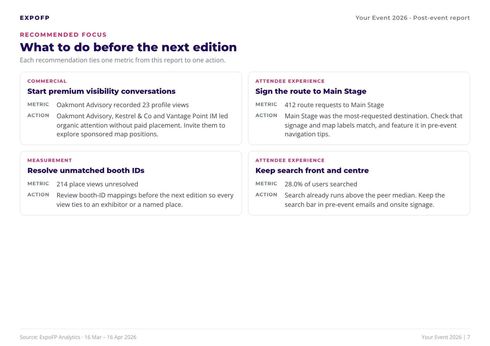
Page 7 · Recommended focus
Four priorities, each tied to one number and one action – across attendee experience, data quality and revenue. Hand it to your team at the wrap-up meeting.
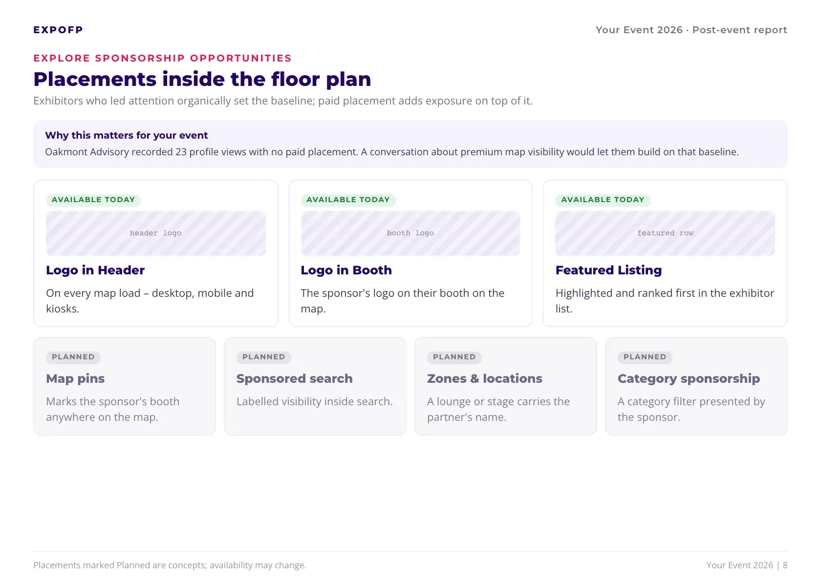
Page 8 · Sponsorship opportunities
Placements available today next to those in development, each with a short explanation. The page opens with your own top unpaid exhibitor, so the pitch starts from their numbers.
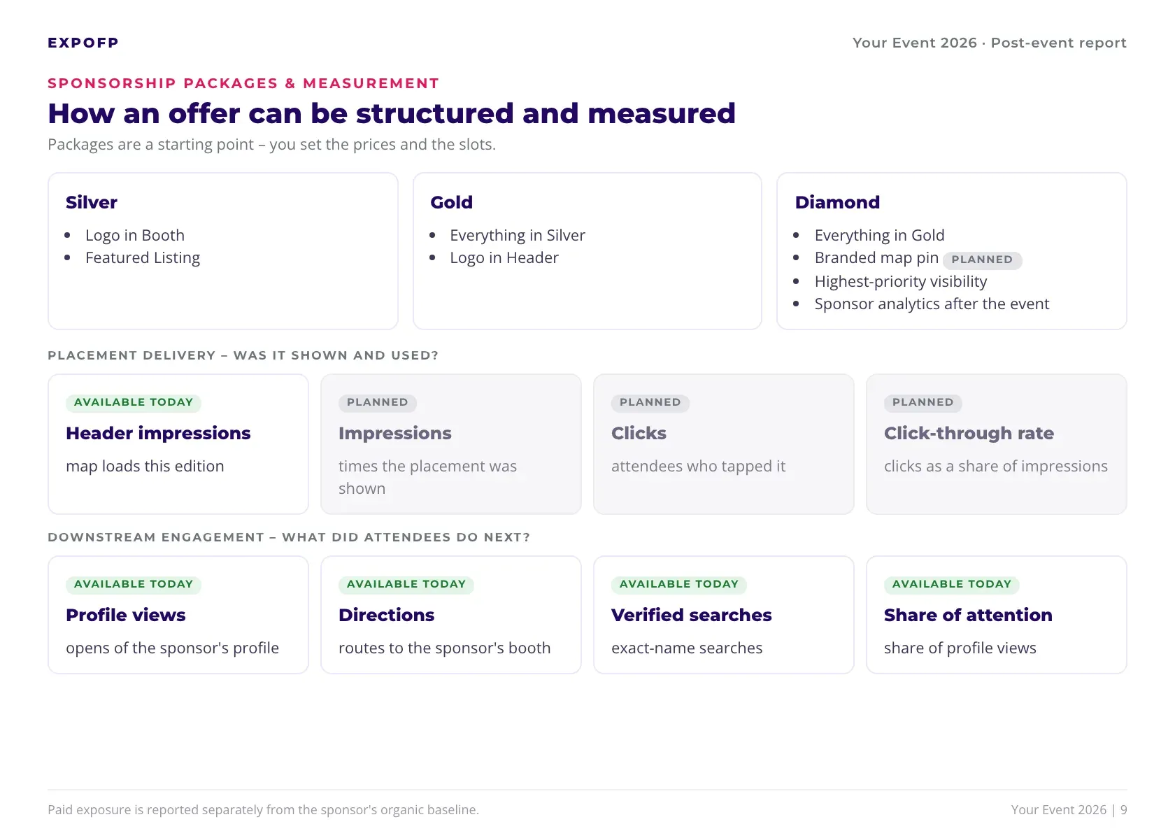
Page 9 · Packages & measurement
Silver, Gold and Diamond as a starting structure, plus the metrics a sponsor will see afterwards. Sponsors get a report on what their placement added, not just confirmation that it ran.
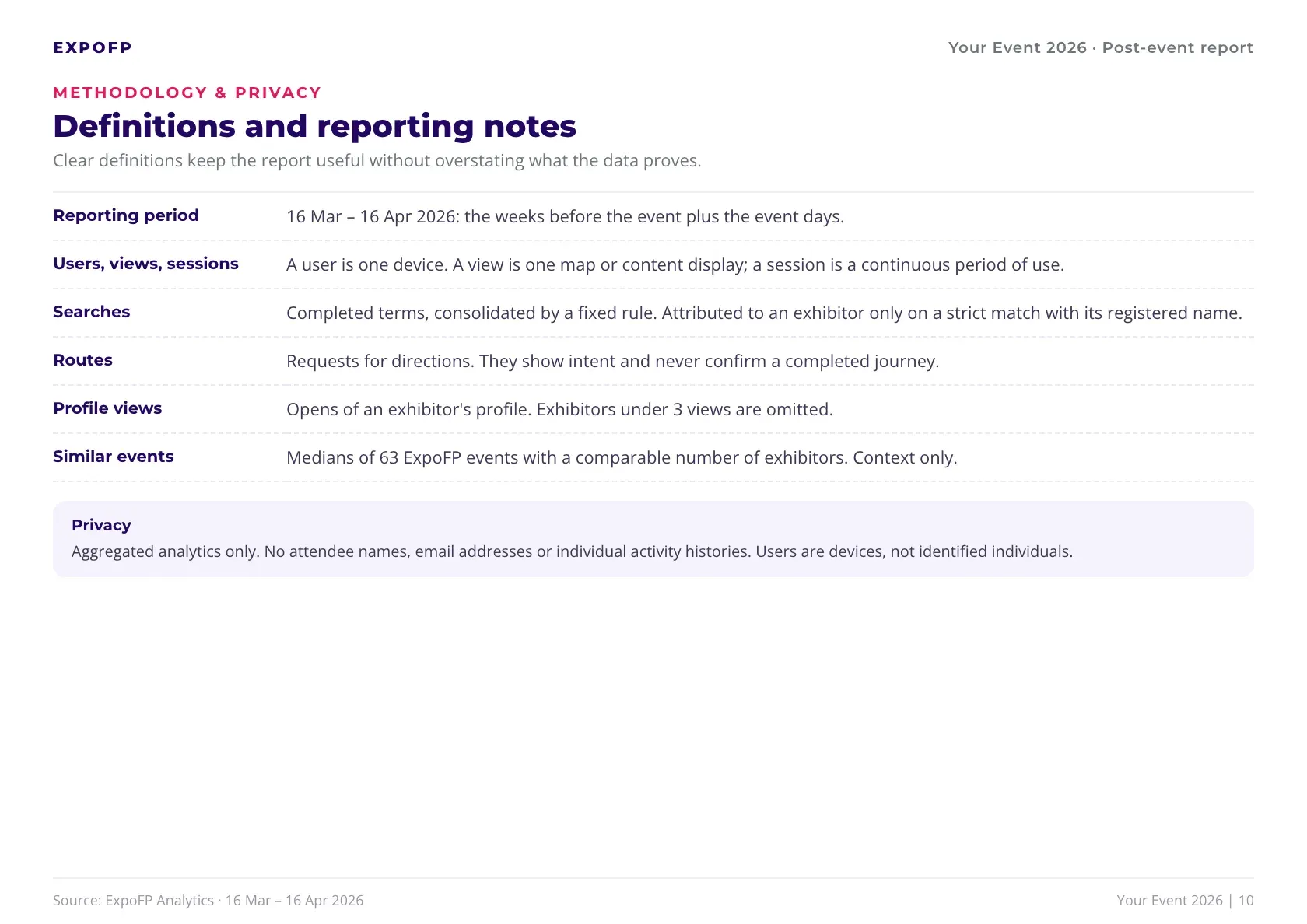
Page 10 · Methodology & privacy
Plain definitions for every metric and a privacy note. When a board member or a sponsor asks how something was counted, the answer is already in the report.
ExpoFP collects floor plan analytics from the weeks before the show and every event day.
Findings, benchmarks and exhibitor cards – generated automatically.
Headline numbers, the full PDF and exhibitor cards, ready to forward.
Every key rate is compared with events of similar size on ExpoFP, so you know where your event stands – and what to fix first. Example event with 872 exhibitors, compared with 63 events of similar size.
| Metric | This event | Median |
|---|---|---|
| Users who searched | 28.0%Above | 17.8% |
| Users who requested a route | 12.9%Above | 3.0% |
| Map views per user | 3.96 | 4.5 |
| Views during the event | 60.9%Above | 59.3% |
You set prices and slots.
AI-written findings, every number verified against the data.
A search counts toward an exhibitor only on an exact name match.
Routes show intent, not completed journeys. Sponsor comparisons describe attention, not causal uplift.
Aggregated data only. A user is a device – no names, emails or activity histories.
No. The report is generated automatically after your event ends.
We'll walk through a sample report and show what yours could look like.